FP Summer 2025
- “For Florida”
by Styliana Resvanis, Emily Mavrakis and Danielle Ivanov - “Shiniqua’s Miracle”
by Danielle Ivanov / Photos by Nate Guidry - “Where’s Albert?”
Photo by Betsy Brzezinksi
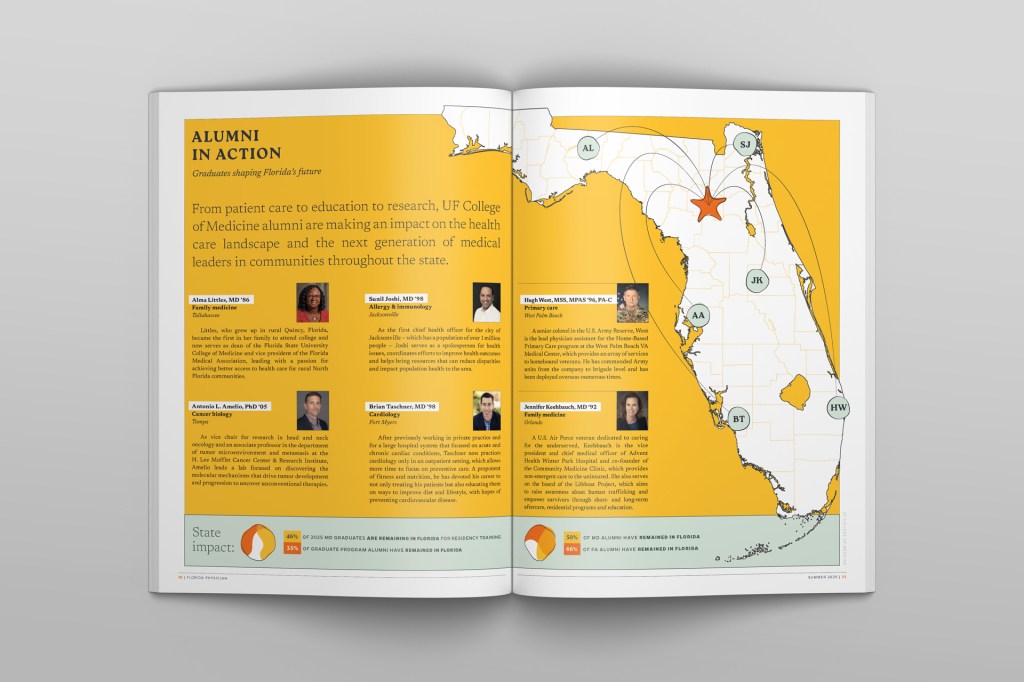
The Summer 2025 issue of Florida Physician magazine begins with a 10-page cover series highlighting the UF College of Medicine’s impact on the state of Florida. Following that is an artfully told patient story with compelling photography.
I used photos to support the copy, but typography would be the main character this time.
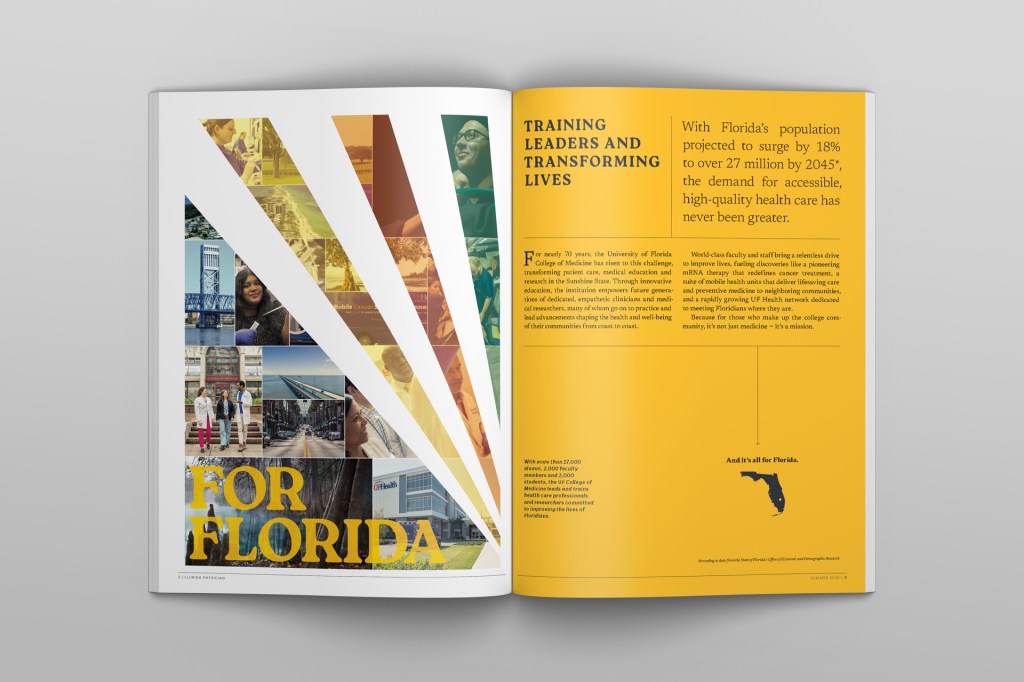
I used saturated colors and a lively, irregular photo collage approach to bring that energy to the page. This also allowed me to combine scenes and include contexts to help the photography speak more clearly. The resulting spreads convey the idea that these myriad community medicine programs work together to create a foundation of service for our students’ medical educations.
Similarly striking to me was how important programs like these are to students’ education. Practicing medicine first-hand for patients who have traditionally found it hard to obtain medical care is a transformative experience for many of these young doctors. To reinforce this idea in design language, I included statistics designed to resemble passport stamps.
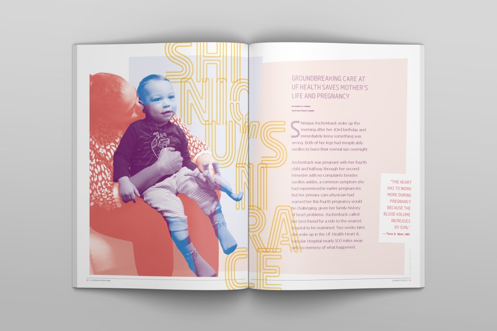
Shiniqua Aschenback was 19 weeks pregnant. She had coded three times, and her doctors had revived her each time. Her heart was failing and couldn’t support her and her unborn son.
I’m reminded sometimes of how different it feels when the work I’m doing is in service of something really important. Shiniqua’s and Shawn’s story is awe inspiring, and it’s told so well here by my friend Danielle.
I wanted to make sure the design served the story as well as it could. I chose a palette of red, blue and yellow; the colors of early childhood and also the playground by the Aschenbacks’ home. The title and marginalia are all set in Ohm, a typeface that — to me — looks like arteries. And I created a hero image from a photo of Shiniqua holding Shawn in her lap at UF Shands Hospital… I color graded her in red and him in blue, so that the area where they overlap is purple. The purple area contains the locations of both her and his hearts, and I illustrated a heart on top of them to represent the time when she was pregnant and they were not individuals but a single life with a single, failing heartbeat.
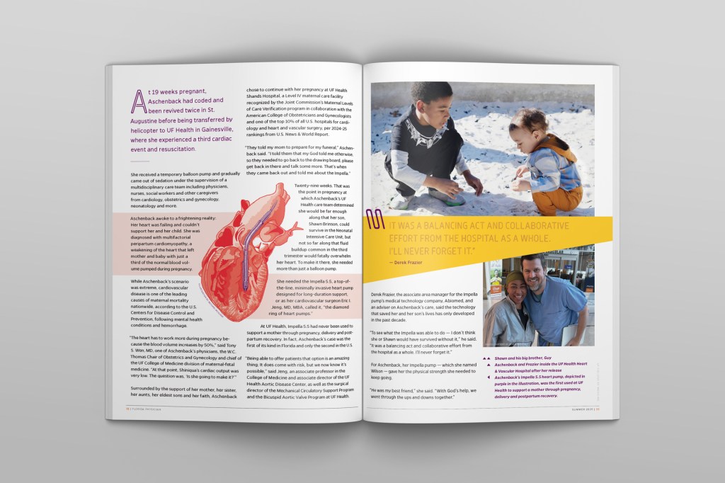
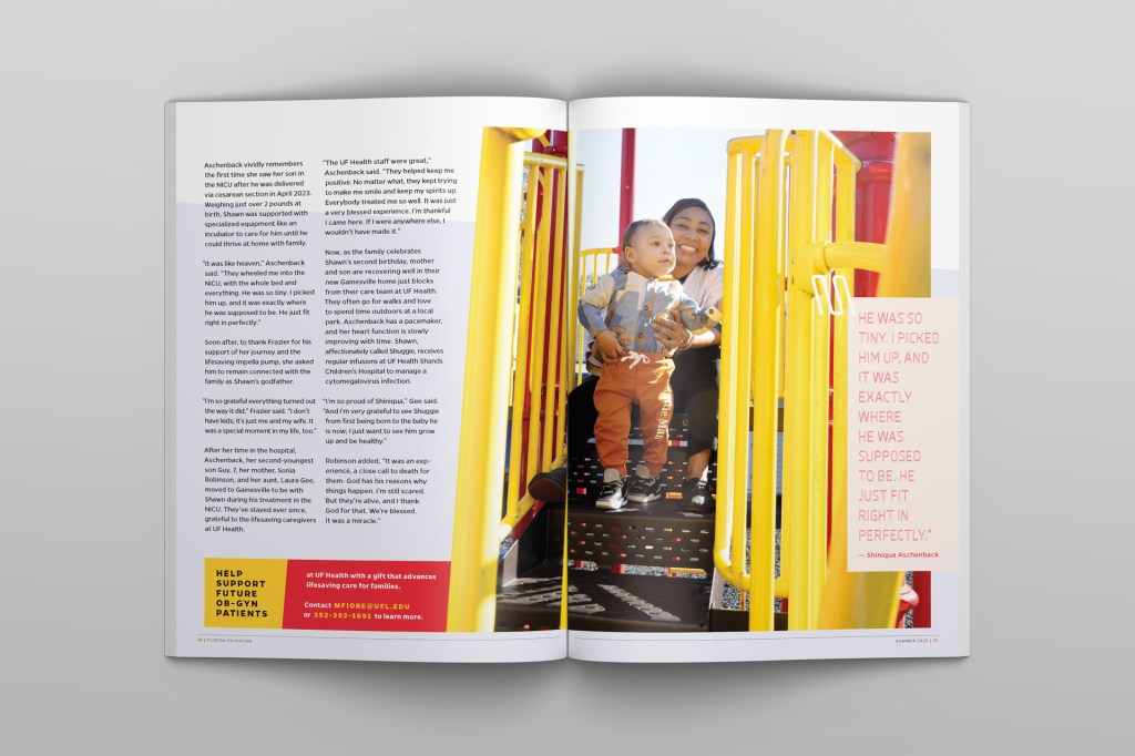
Supporting photos of the family and an illustration of the Impella pump that saved their lives help tell the story on the second spread, and the third spread gives most of its real estate to a gorgeous photo by Nate Guidry, which repeats the primary color scheme used throughout the story.
I closed the piece with a quote from Shiniqua that perfectly drives home the point of it all:
“He was so tiny. I picked him up, and it was exactly where he was supposed to be. He just fit right in perfectly.”
— Shiniqua Aschenback
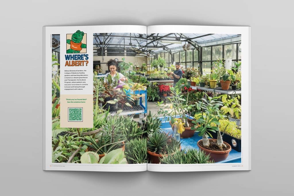
We had 2 pages available in our layout budget, and I wanted to use them frivolously.
Well, not frivolously. But I wanted to use them to provided value to the reader without providing any obvious value to the college. To me, this is one of the things that separates a lot of the best magazines from the marketing kinds that one expects from a University.
We floated a few ideas, but landed on a “Where’s Albert” spread, in which we would hide a 4″ plushie of our mascot Albert Gator in a photo and invite readers to find him. We went to the greenhouse at Wilmot Botanical Gardens for this first installment, and included a QR code to see the solution on our website. This was one of the most visited pages on our site for weeks following the magazine’s ship date.
Can you find Albert?
