visual identity for
a pollinator-friendly
landscape designer
When the folks at Bee Good Landscape reached out about a visual identity, I knew we could create something really cool together.
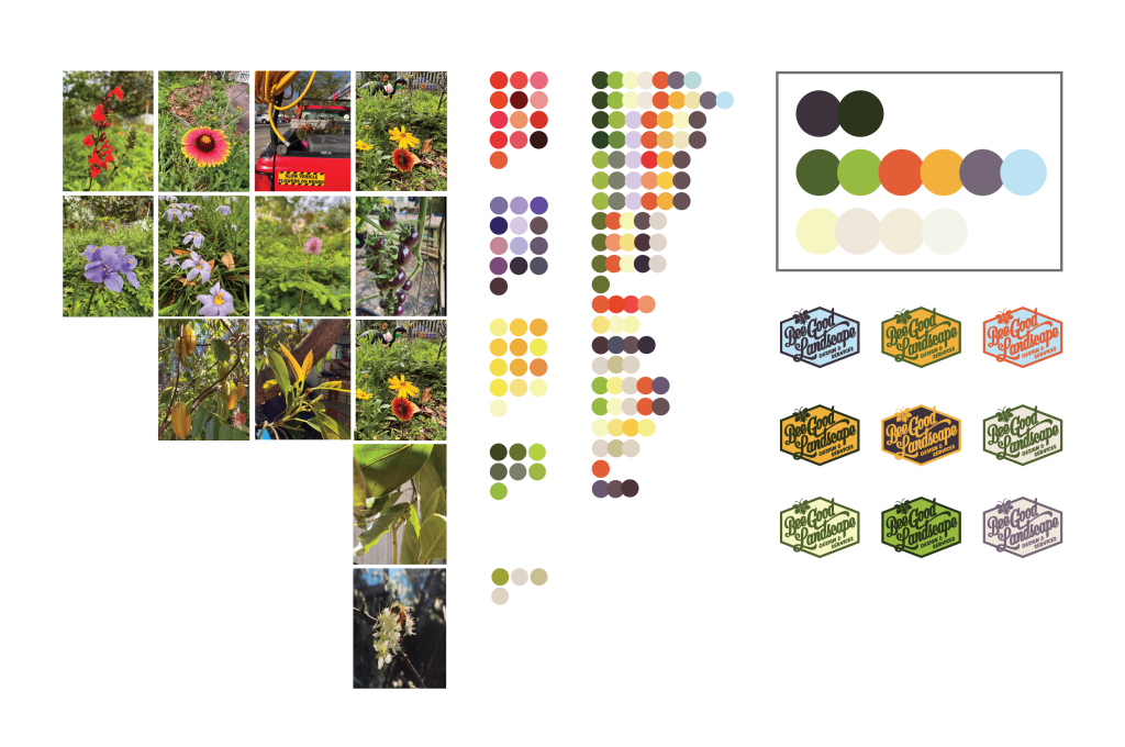
I started with a dozen photos from the client of native pollinator-friendly plants. With an eye toward a functional and harmonious color palette, I extracted numerous versions each of six different hues. Then I combined and recombined those colors until I landed on a finished palette that truly speaks to the value of the work Bee Good does.
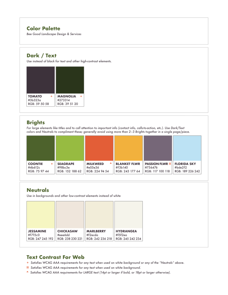
I provided the client with a guide to their color palette. This spells out the color formulations for both print and digital use. It also provides guidance for using the brand colors in accordance with WCAG requirements for accessibility.
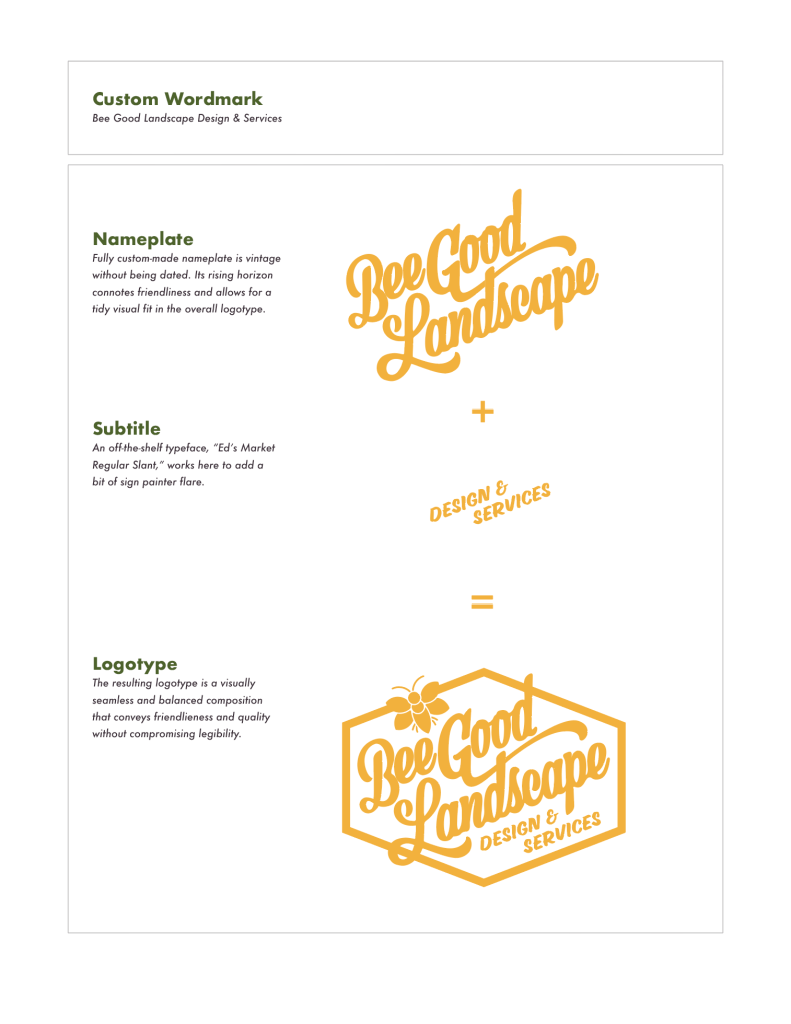
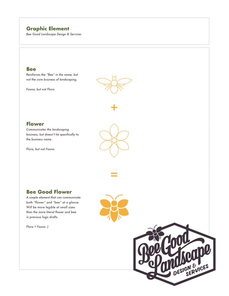
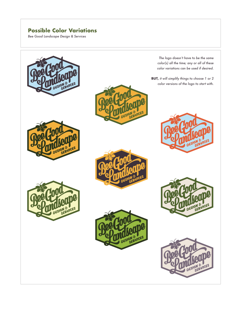
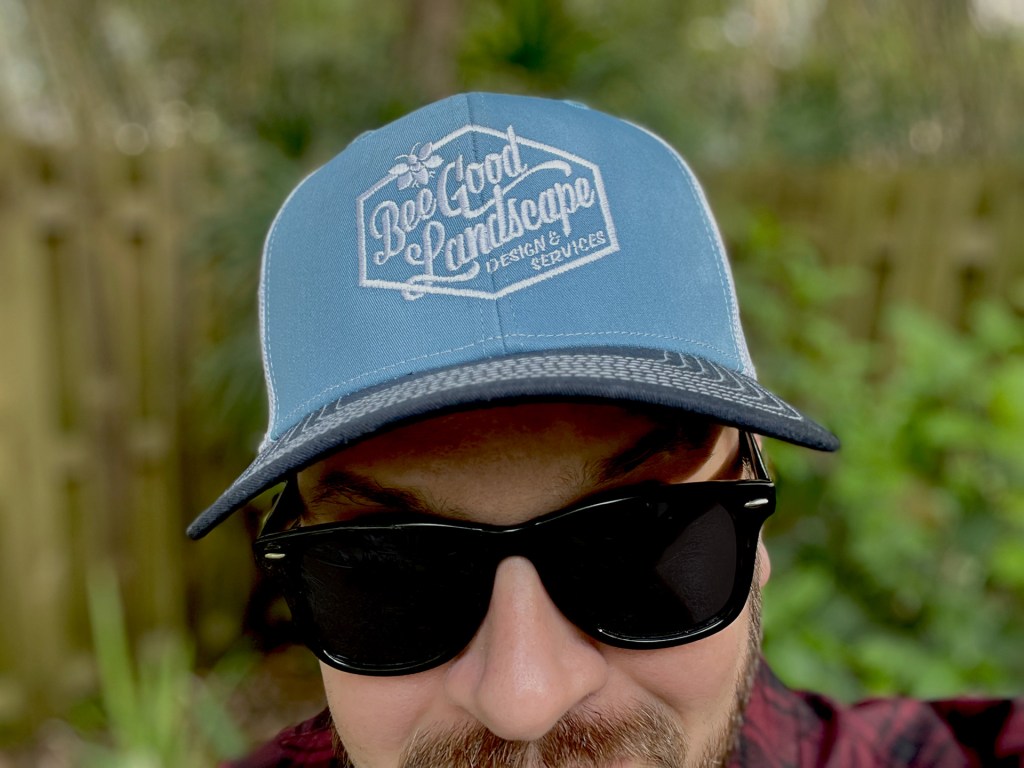
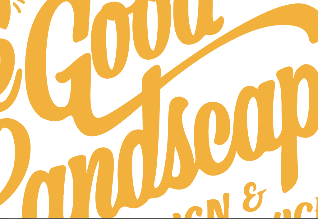
Then I drew up some custom lettering for a wordmark and combined a bee and flower into a single graphic element to adorn the logo lockup. I provided the logo lockup in 9 color variations, to be used interchangeably by the client as desired. The Bee Good Flower can also be used as a standalone graphic element to great effect.
This visual identity system is now employed across a website, social media, uniforms and swag items, and a fleet of five vehicles.